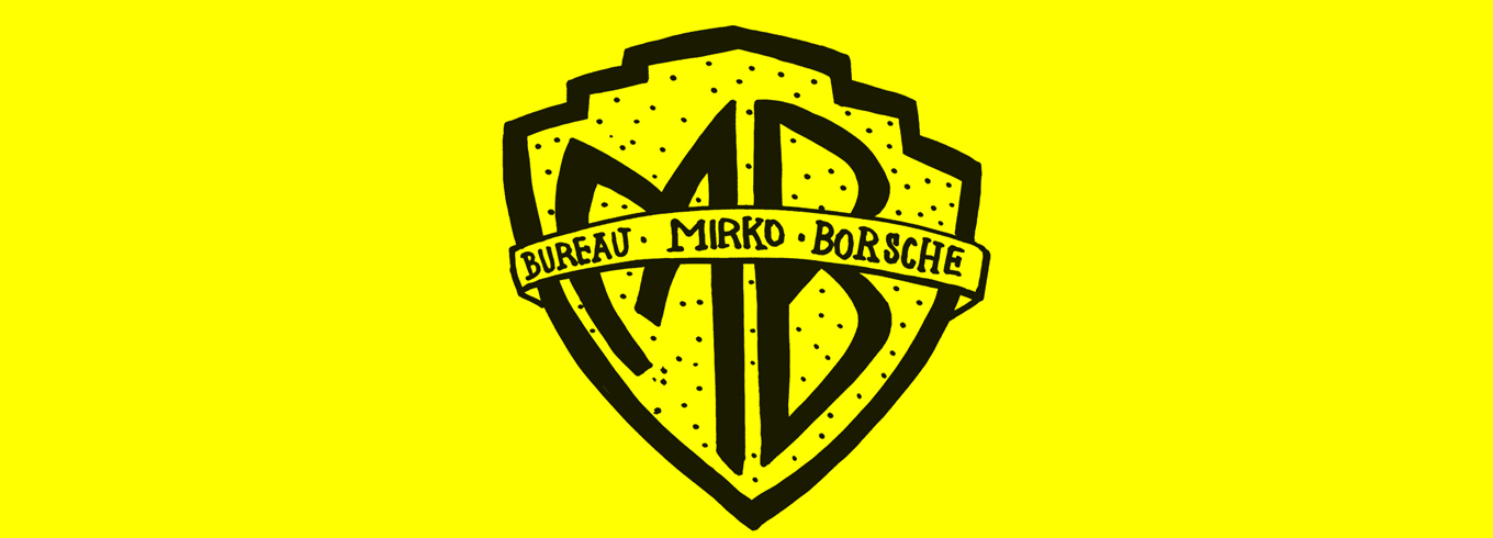
 The Schaustelle is calling you! And the Munich-based Bureau Mirko Borsche has given it its own distinctive voice. You can hear that voice throughout the city, in the Kunstareal, in Maxvorstadt, on the site of the Pinakothek der Moderne, in the Schaustelle itself, on advertising columns and leaflets, in print ads or on the web. With the warning colours of yellow and black, as seen in wasps, fire salamanders, or the Munich flag… With a typeface that deliberately echoes the site’s scaffold character. With its own logo, which changes over time, just like the Schaustelle itself. And with drawings by Gian Gisiger – free responses to the projects held at the Schaustelle, expressed with wit and humour. The images demonstrate the power of graphic design to combine an array of disparate topics through the elements of design. After Gian Gisiger, Gaëlle Renaudin from Lausanne took over the graphic ‚baton‘ and brought her own lyrical, Surrealist style to the illustrations, a style which she dubs „tropical naïv‘.The Schaustelle’s corporate design was conceptualized by Bureau Mirko Borsche and developed in cooperation with the neue Sammlung – International Design Museum Munich. Their joint corporate design project forms an open dialogue with the Schaustelle, accompanying it throughout its duration as an adaptable work-in-progress. The typefaces ‘Schaustelle Grotesk’ and ‘Schaustelle Serie’ were designed by Bureau Mirko Borsche in collaboration with ECAL (Haute école d’art et de design – University of Art and Design Lausanne).